Saving time and resources with an AI-driven incident reporting app
UI/UX Design at GKN Aerospace during 8 weeks internship 2024
The HSE team struggled with time-consuming incident report management due to multiple legacy systems and manual validation.
Designing a user-friendly interface for a new AI-driven web application streamlined the workflow through clear information and automated data visualizations, enhancing accuracy and reducing processing time.
Situation
The HSE team previously used multiple legacy systems for incident reports, leading to inefficiencies and data inconsistencies. After the Data and Analytics office developed a prototype showcasing AI's potential to improve incident translation and classification, I was tasked with designing a new interface that aligned with business objectives and user needs.
Solution
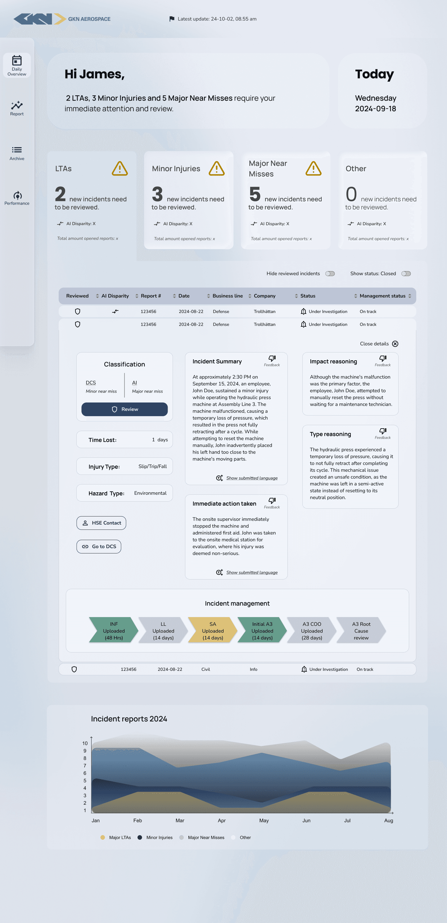
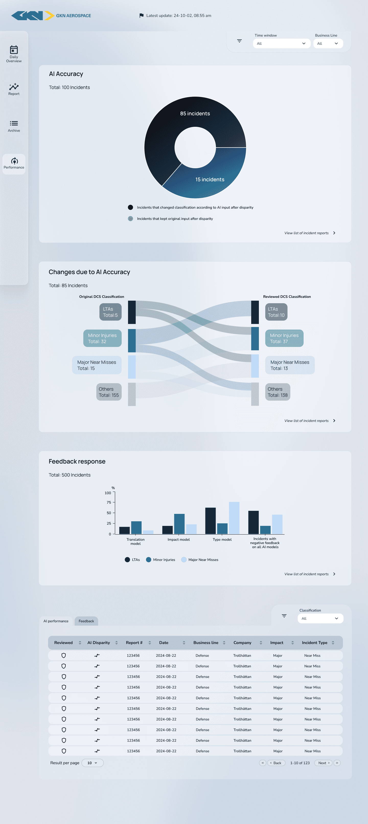
A user-friendly interface to visualize and enable the analysis and reporting of safety incidents, leveraging an AI model to empower and support GKN Aerospace’s international HSE team.
Key Results
Streamlined workflow, enabling more in-depth analysis and strategic work
Reduced use of time and resources
Improved data accuracy through a standardized work flow

Research
The users' pain points and needs became clear after conducting user interviews and mapping user flows, guiding the design process. OKRs and user stories were also established to ensure alignment with business goals and user needs.
User pain points:
Time consuming work flow
Translating data input manually
Produce data visualizations manually
User needs:
Clear information about new incident reports, data quality and data freshness
Automated translations and data visualizations
Ability to prioritize analysis and strategic work
"This could save a full time-position"
UX Design
A UI design concept was created in two days to pitch the app. After approval, “definitions of done” were set, and wireframes with a UI design system were developed. A workshop identified visualization needs, and by week five, designs were finalized. Prototypes were delivered within two weeks, with the project concluding in 7–8 weeks through a detailed design handoff ensuring smooth developer collaboration.

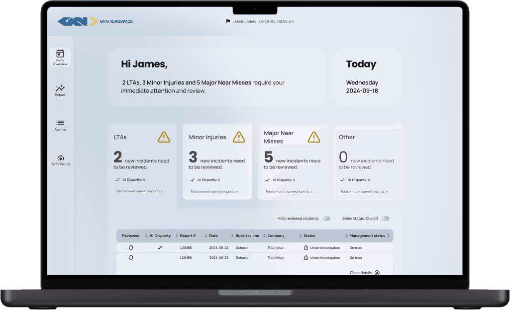
UI Design Pitch. A significant milestone was the delivery of the UI design concept to stakeholders, which showcased the new possibilities and improvements with the web application.
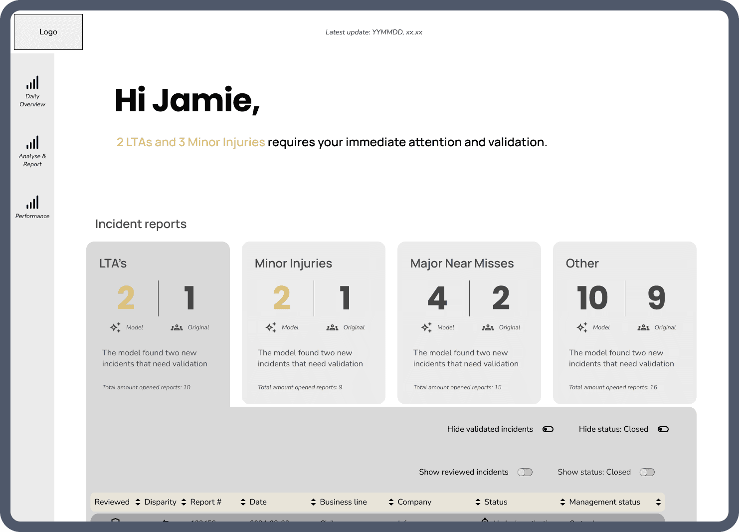
Early wireframe of first page. Many iterations of the first page “Daily Overview” were made to ensure clarity and focus on displaying the most important information needed for the users.
Reflections
Colours and complex data visualizations
Choosing the right color combinations for complex data visualizations is challenging and time-consuming but offers valuable insights into the complexities of color usage.
Communicating the Design
Working closely with developers provided valuable insights into their workflow and improved our ability to deliver clear, effective designs, ensuring smooth implementation and demonstrating the value of UX to stakeholders.
Redesign of Initial Prototype
Redesigning the prototype in Superset felt limiting due to its module-based format but offered insights into what to exclude in the new app and deepened my understanding of the project.