Enhanced usability by improving information architecture on mobile website
UI/UX Design - Hunddagis Klippan
The mobile website had usability issues due to poor information architecture and complex user flows.
Design was streamlined by restructuring the information following user flows.

Situation
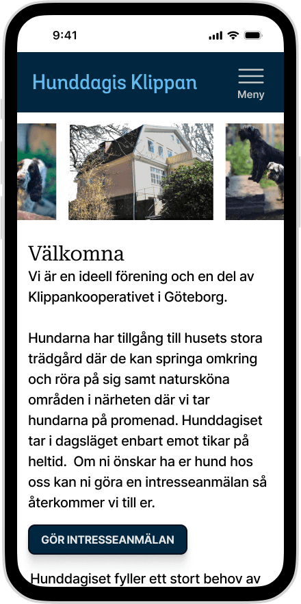
The already existing website for Hunddagis Klippan was filled with information for both dog owners and others who wants to learn more about the work that they do.
However, the mobile website had usability problems, mainly regarding information architecture, creating complex user flows.
Solution
Grounded in heuristic evaluation and design principles, I focused on the following usability solutions:
Increase credibility for the users by improving information architecture
Reduce cognitive load by streamlining user flows
Enhance overall usability and increase consistency by following conventional design standards
Key Results
Usability was increased.
The information architecture was clearer which increased credibility for the users.
Design was streamlined creating simplified user flows for all users.
Consistency was higher among pages and the website was now following design principles.

Research
During my initial interaction with the website, I found usability problems regarding faulty interactions and functions and also that the website wasn’t created with mobile users in mind.
Two main flows were detected:
Gather information about the work behind Hunddagis Klippan
Apply for dog day care
Diving deeper to analyse the website, using heuristic evaluation and design principles, I found more room for possible usability improvements. I found issues regarding how the information was structured, consistency of the website and user flows demanding the users to search read each page to fulfill a task as well as vague functions and interactions.

UX Design
Information architecture was streamlined
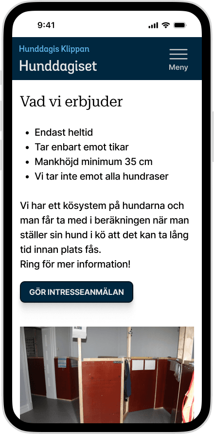
I began by extracting and categorizing the website's content, which revealed duplicated information and complex headings. I restructured the information architecture and updated page headings to better reflect the content.
Wireframing & Prototyping to create clearer user flows
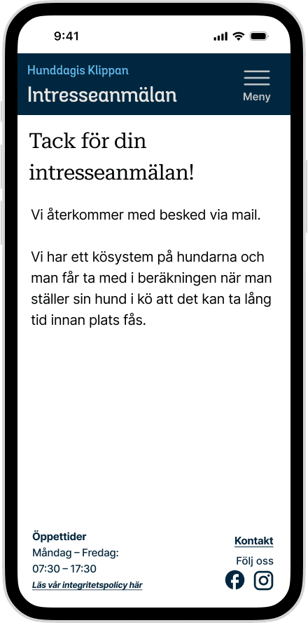
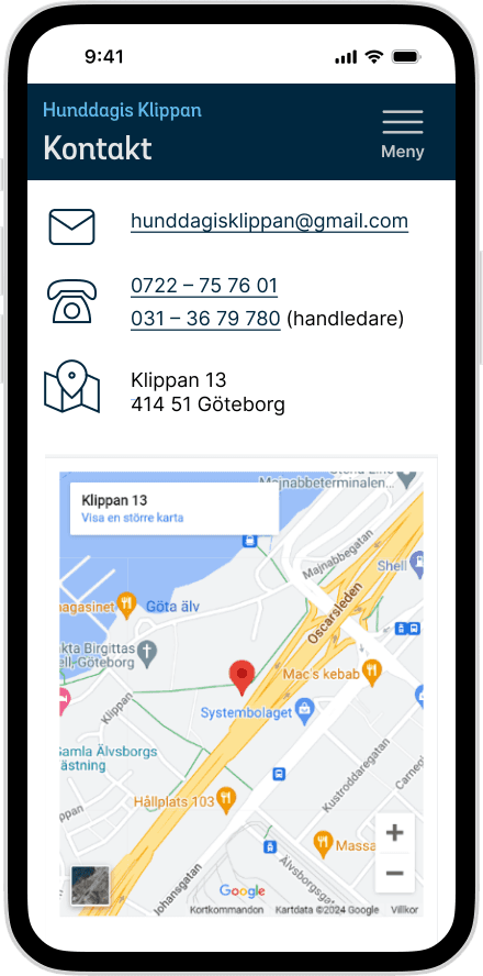
Wireframes were created based on the restructured content and updated headings, with CTA buttons added for easier navigation. The contact info was streamlined and moved to a separate page linked in the footer. A dog daycare application form was designed, along with a page for the integrity policy.

Reflections
At one point in the middle of the design process I felt really insecure regarding my design choices and how I motivated them. I had to find a balance between (1) what’s correct regarding UX design principles and (2) not loosing the foundations of the website and its users.
I realized that a lot of the earlier design that I had done actually was good design based on good design decisions.
So, in the end I chose to loose the latest iterations I made and instead continue working on the earlier prototypes for my final designs.